

10 Usability Heuristics by Jakob Nielsen

Jakob Nielsen introduced 10 usability heuristics, guiding principles for creating user-friendly interfaces, aimed at enhancing user experiences. Consider them as intuitive design rules for seamless interactions.
Nielsen's usability rules are broad ideas, not exact instructions. They help make your website or product easy to understand and use. The aim is to design an interface that users find enjoyable and easy to navigate.
1. Visibility of System Status
The first rule is about making sure users know what's going on and get feedback quickly. Basically, it means the system should let users know what's happening through suitable feedback, so they know their request is being worked on.

Displaying that a file is currently uploading.
2. Match Between System and the Real World
The system should use language that users understand, using words and concepts they're familiar with instead of technical terms. It should follow real-world conventions, presenting information in a logical and natural sequence.

The Recycle Bin functions similarly to a real-life dustbin.
3. User Control and Freedom
Ensure users can navigate and exit easily, such as offering a 'Cancel' or 'Go Back' option in multi-step processes.
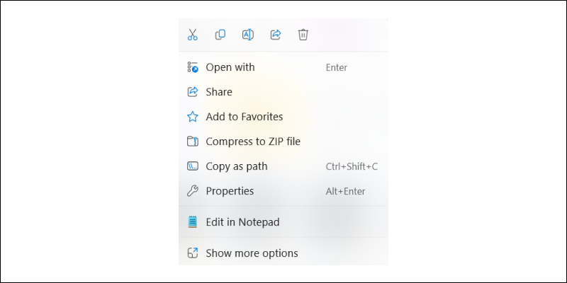
Users can smoothly navigate through functions or perform deletions
4. Consistency and Standards
Maintain consistent conventions and design patterns across your interface, such as using uniform button styles and colors for similar actions.
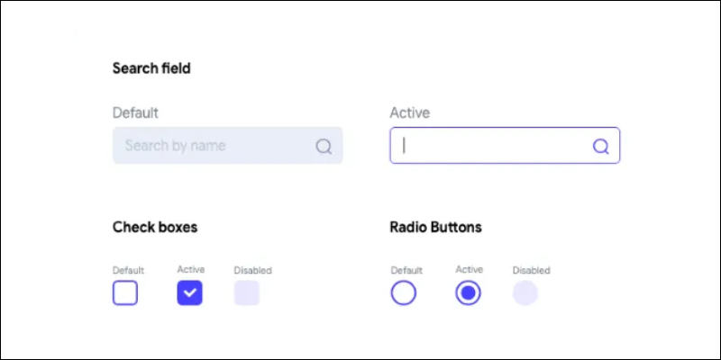
Buttons are consistent in color and design.
5. Error Prevention
Error prevention is about stopping mistakes before they happen, rather than fixing them later. Guide users with suggestions, smart defaults, and helpful constraints . Also, make it simple for users to backtrack during their journey.
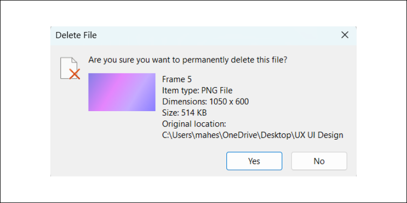
Requesting confirmation prior to file deletion.
6. Recognition Rather Than Recall
The "recognition over recall" principle suggests reducing the burden on users' memory by ensuring actions, elements, and options are visibly clear. Avoid requiring users to remember each button's function; prioritize making options recognizable instead. Recognition proves more effective and efficient than relying solely on memory.
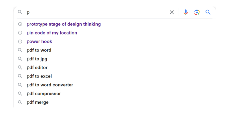
Presenting multiple options can alleviate user burden.
7. Flexibility and Efficiency of Use
The "flexibility and efficiency of use" guideline suggests that systems should adapt to accommodate diverse user needs, catering to both advanced users and newcomers. Prioritize displaying common functions by default, while reserving advanced options for experienced users.
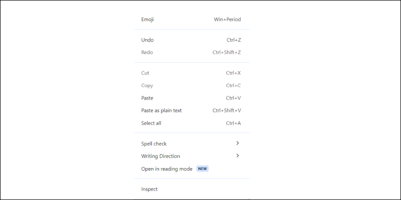
Both newcomers and experienced users can navigate easily.
8. Aesthetic and Minimalist Design
Aim for a simple and minimalist design, including only essential elements to minimize cognitive load and visual clutter.

Offer only essential information.
9. Help Users Recognize, Diagnose, and Recover from Errors
To assist users in identifying and resolving errors, the system should promptly alert them using clear, concise language, and offer solutions.
Avoid leaving users unsure of what to do when errors occur. Effective error messages should explain what happened, how to rectify it, and how to proceed. Offer constructive advice, and ensure the error messages are friendly and empathetic
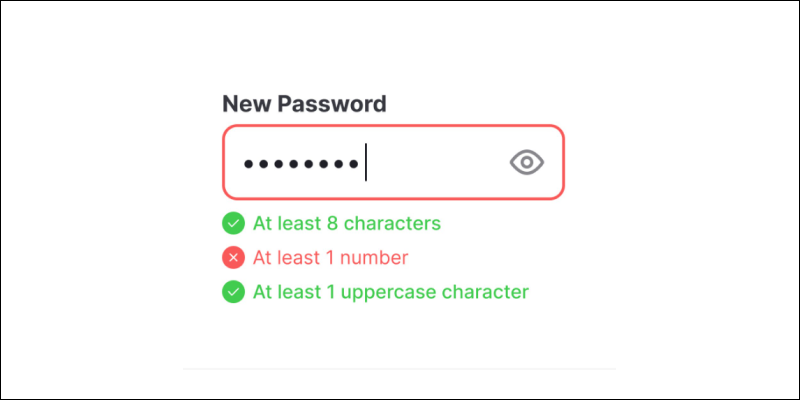
Users should be able to understand the problem and its solution by reading the error message.
10. Help and Documentation
The interface must consistently offer user assistance and documentation. It should be easily accessible, focused on the necessary tasks and steps, and concise.
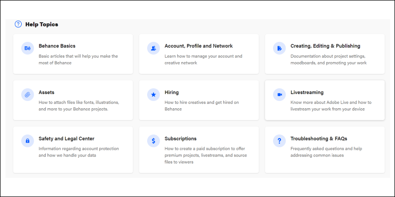
This assists users in completing their tasks efficiently, without wasting time searching.
More such articles:
https://www.youtube.com/@maheshwarligade
